



07 Jul The Origin of Found Palettes
A design resource that started with a feeling.
Can a moment become a room?
That’s the question Found Palettes started with. Not a series concept, not a content strategy — an experiment. I wanted to know if the places that stopped me when I was traveling — the ones that felt calming, or quietly inspiring, or just unexpectedly right — could actually translate into a design direction. Into a color palette. Into a material story. Into a whole house.
I’m not a vibrant designer. That’s not a disclaimer — it’s a description. The things I’m drawn to are nature-driven and tonal: the warm end of the grays, the muted blues and greens, the colors that feel less like a choice and more like a condition of the light. I appreciate bold, saturated interiors. I genuinely do. But that’s not how I read a space, and it’s not how I design one.
The way I think about it: architecture is the framework. It’s the foundation. And the foundation’s job isn’t to compete with what goes on top of it — it’s to support it. So when I’m designing a home, I’m building a base that’s steady enough to hold everything else. The vibrancy comes from the art on the walls. The collections. The people. Those things are personal and specific — they don’t need the architecture fighting for the same territory.
Found Palettes is that philosophy made visible.
A moment first. Always a moment.
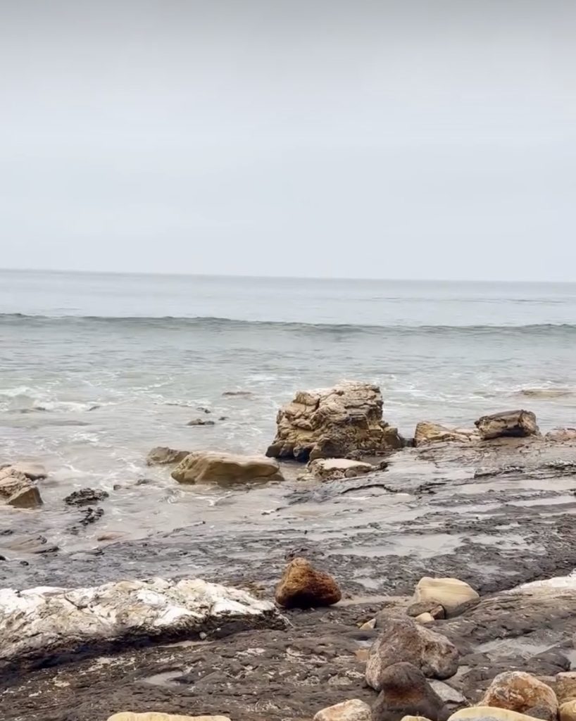
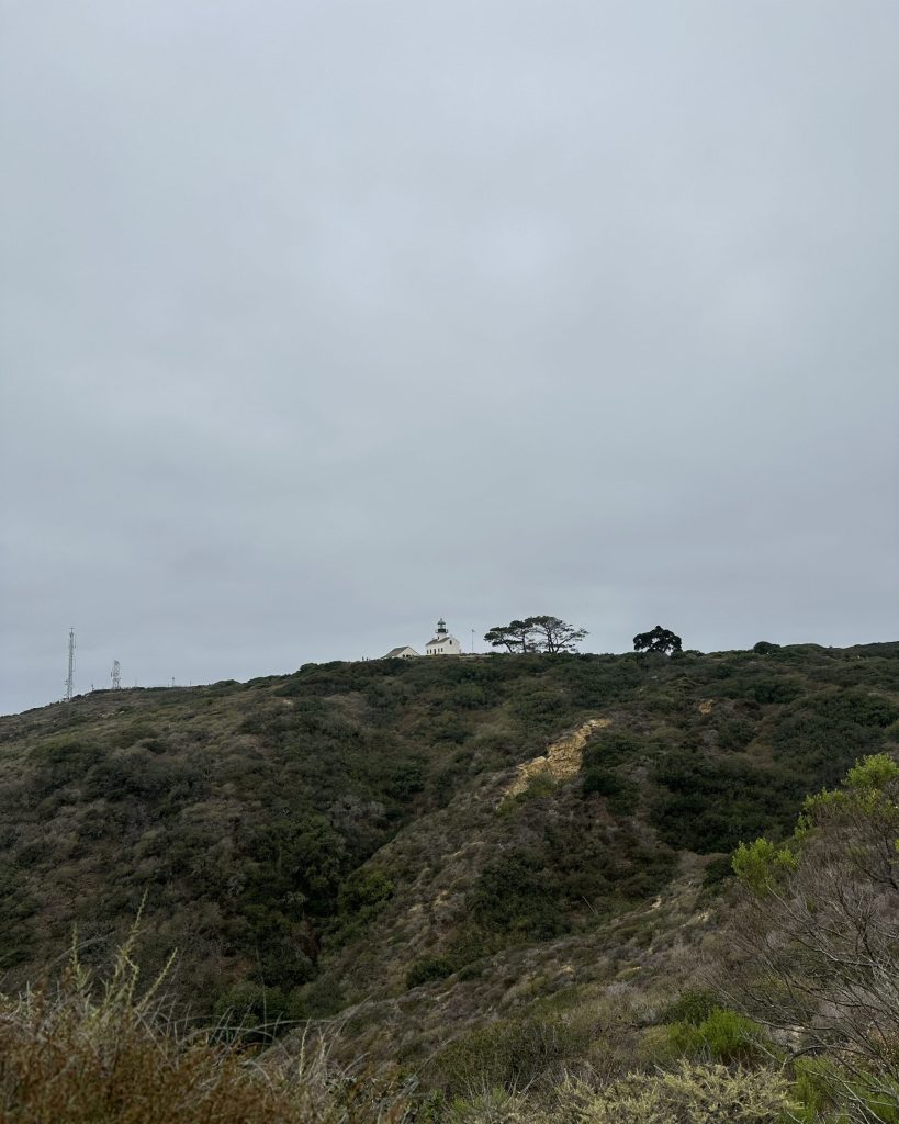
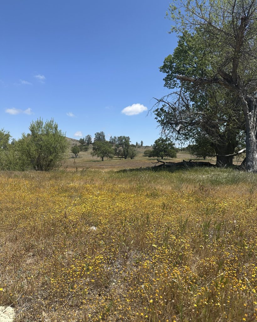
The series starts somewhere specific: I’m looking for the moments that made me stop.
Not a Pinterest board. Not a project I admired. A moment. A place where I was traveling or exploring and something about the light, the color, the texture of the environment just — landed. That stillness. That quiet feeling of this is exactly right.
Those moments were already in my camera roll. I just needed to look at them differently — not as travel photos, but as design directions waiting to be named.
Found Palettes is where that practice landed.
How a palette actually gets made
I’ll walk you through the process, because I think it demystifies something that can sound more abstract than it is.
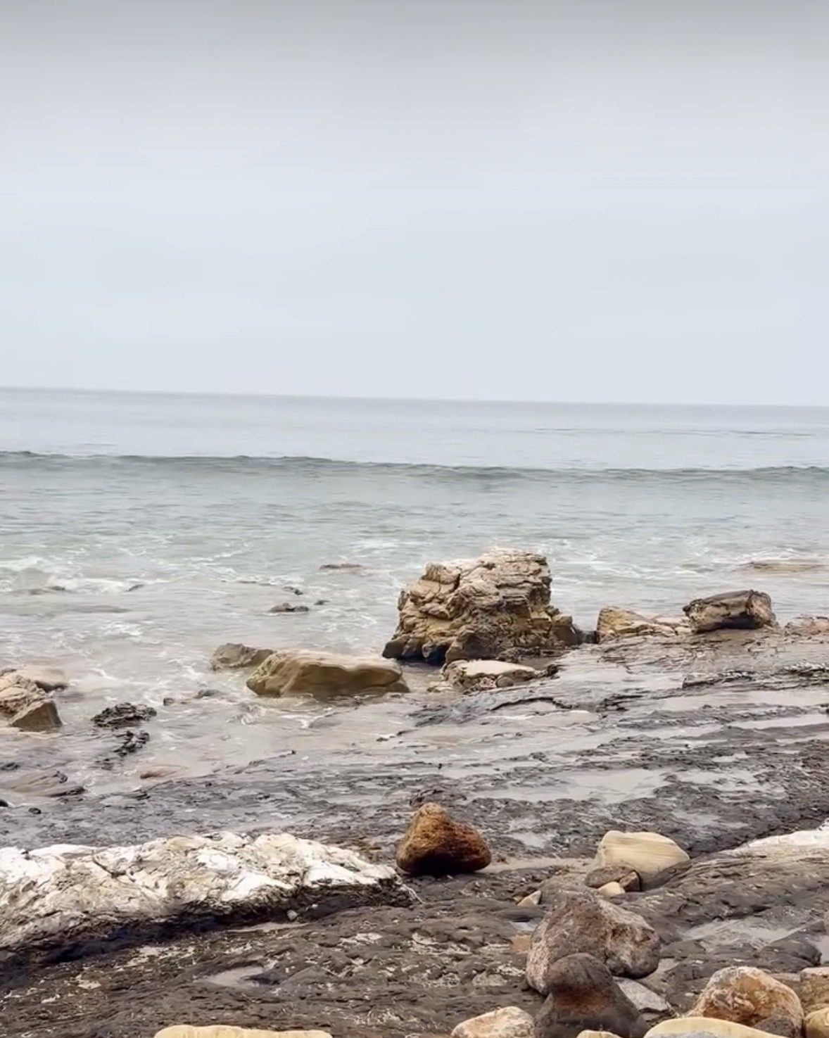
1. Stop. Take the Photo
It starts with a photograph — always one of mine, from a place that stopped me.
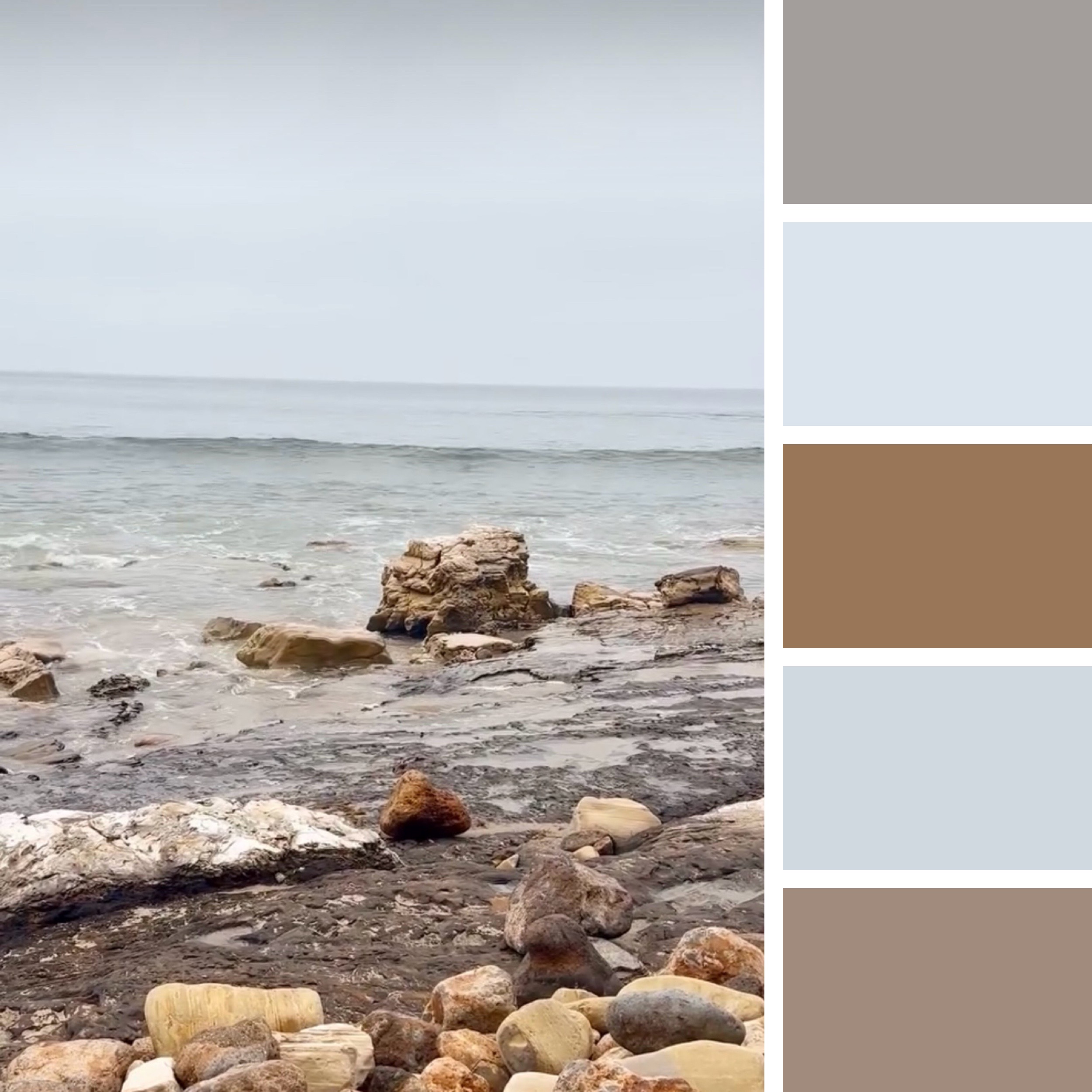
2. Open Coloors
I open it in Coolors and let the algorithm extract a starting palette. There's a randomness to it that I actually value. I'm not trying to control the first pass. I'm cycling through extractions quickly, making instinctive calls: I like that. I like that. Too many blues. Try again. The goal is to land on a set of colors where I look at them together and feel something that matches what I felt in the photograph.
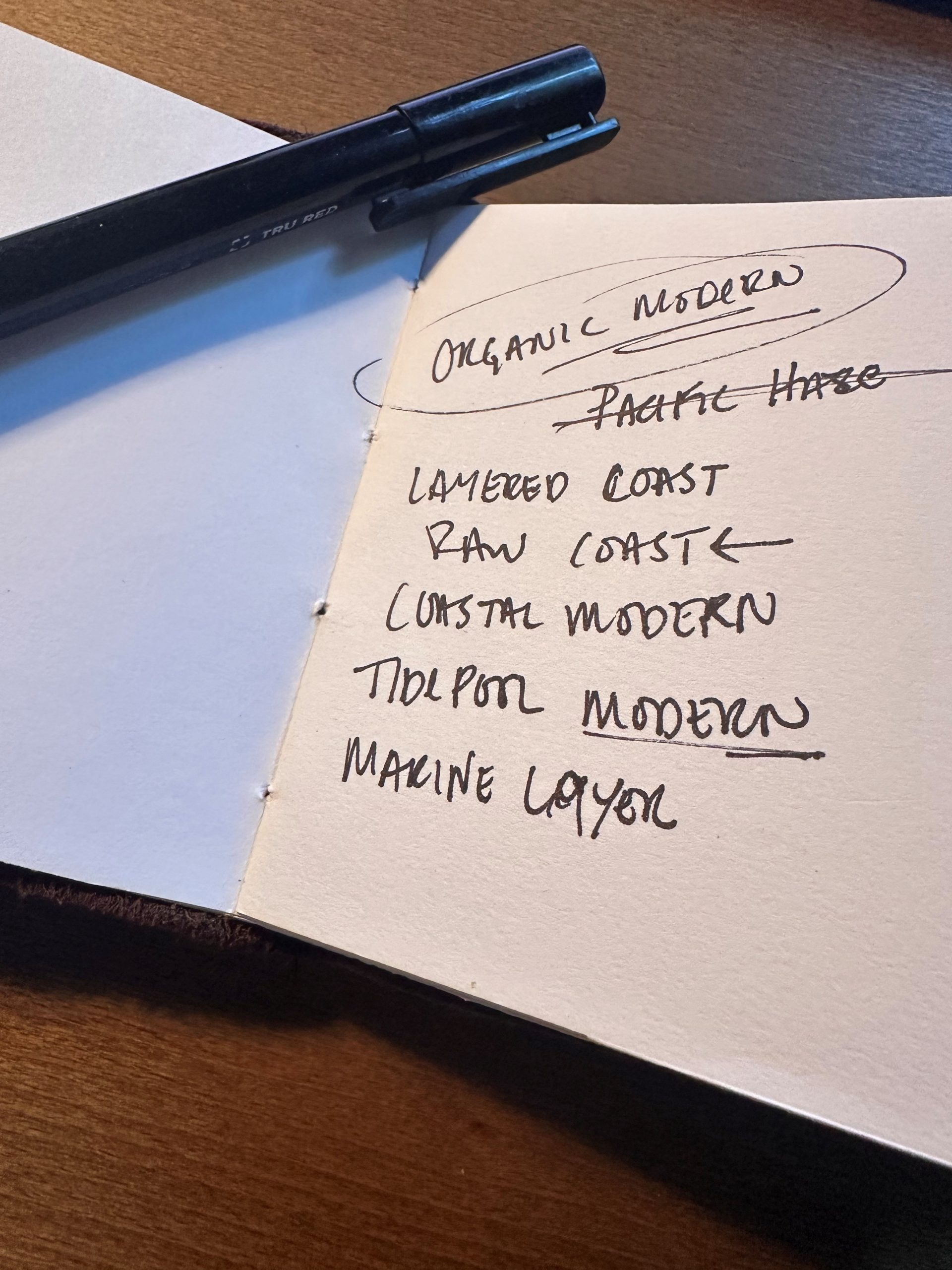
3. What's in a Name?
Once I have that, I name the style the palette is giving me. Not just the colors — the whole design sensibility they're pointing toward. Organic Modern. Pacific Haze. Tidepool Modern. The name is a commitment. It tells me what the palette is allowed to be.
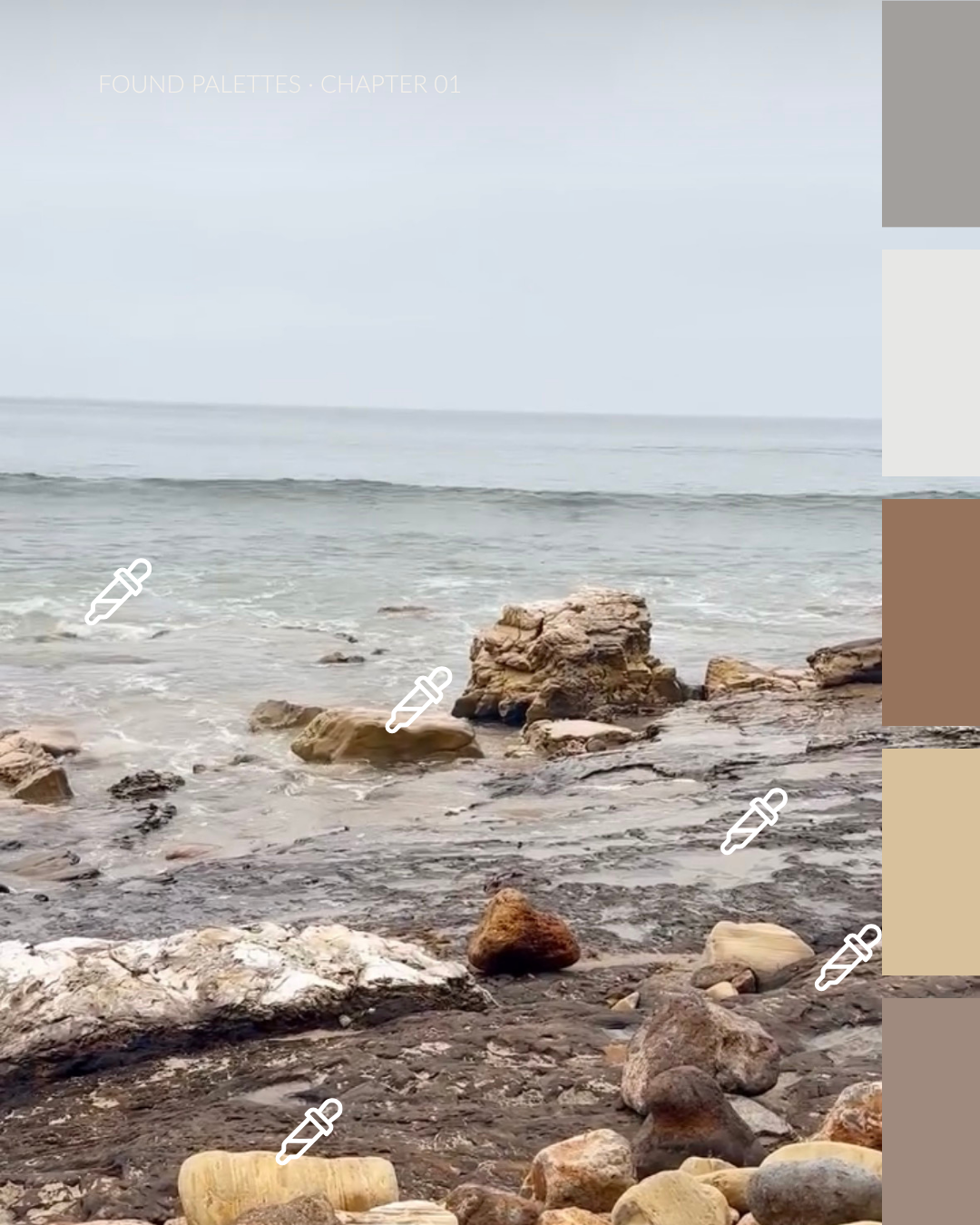
4. Fine tune the Palette
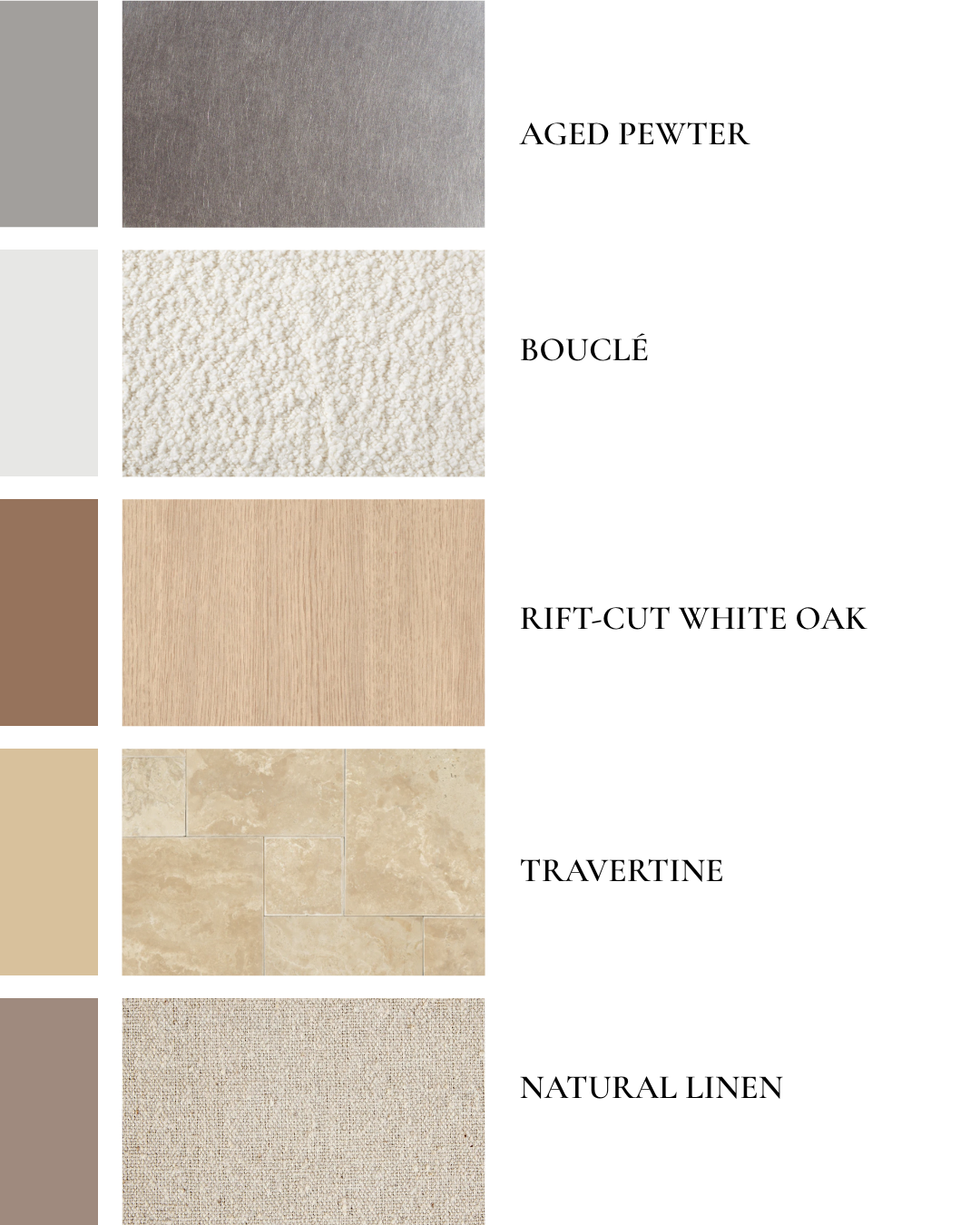
Then I go back in and hand-edit. This is where the Coolors extraction becomes a starting point rather than a finished answer. I'm adjusting colors for material legibility — asking not just what color is this but what does this color reference in the physical world?
5. Curate the Material Palette
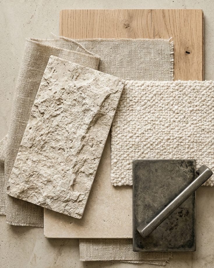
That's what defines the style. Not the name, not even the hex values — the materials. Organic Modern Malibu, our first chapter, becomes real when you put natural linen, bouclé, rift white oak, warm travertine, and aged pewter in the same sentence. That's a vibe. That vibe defines a space. And that space, if it's working, should evoke the same feeling as the moment the photograph came from.
6. Match the Moment, not a Moodboard
Here's the thing I want people to take away from this series: Found Palettes isn't about replicating a room you loved online. It's about designing toward a feeling you've already had.
What comes next
This series will continue to grow. Each volume draws from a specific place and a specific set of photographs. Each chapter within a volume is its own palette, its own named style, its own set of materials.
The full palette for each chapter — hex colors, material pairings, and application notes — is published as a companion carousel on Instagram at @larcdesignco. This blog is where those palettes get the longer treatment: the context, the methodology, the why behind the choices.
If you’re in the middle of designing a space and you’re not sure how to name what you’re after — start with a photograph. Start with a moment. The palette is already in there.
Found Palettes is an ongoing series from Larc Design Co. New volumes and chapters release weekly on Instagram and are archived here with extended editorial entries.
No Comments