



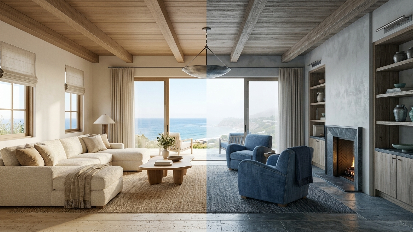
21 Jul Found Palettes Vol. 01: Two Palettes, One View
Organic Modern vs. Pacific Haze
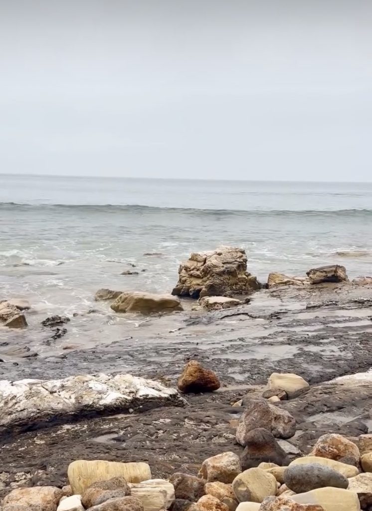
The same tide pool. The overcast sky. The same stretch of coastline ot Point Dume in Malibu, California.
Two completely different rooms.
That’s the premise behind Found Palettes, our ongoing design resource series that pulls color stories directly from photography. Not from trend forecasts. Not from paint chip displays. From moments. From light. From the specific quality of a place at a specific time of day.
This post is a closer look at two palettes drawn from a single photograph – Ch. 01: Organic Modern Malibu and Ch. 02: Pacific Haze – what they share, how they diverge, and why understanding the difference actually helps you design a better space.

The Source Image
Both palettes originate from the same photograph: a low-angle view of the Point Dume tide pools on an overcast afternoon. The water was flat. The rocks were wet. The sky was that particular California gray that isn’t cold – it’s just diffused, like the light is everywhere at once and nowhere in particular.
In the photograph, you can see both of these palettes simultaneously. The warm tones live in the kelp-stained boulders, the sand-colored surf foam, the bleached rock faces. The cool tones live in the water itself – that blue-gray you get when the Pacific is reflecting nothing but cloud.
What Found Palettes does is separate those conversations. One palette per chapter. Each one a cohesive design direction.
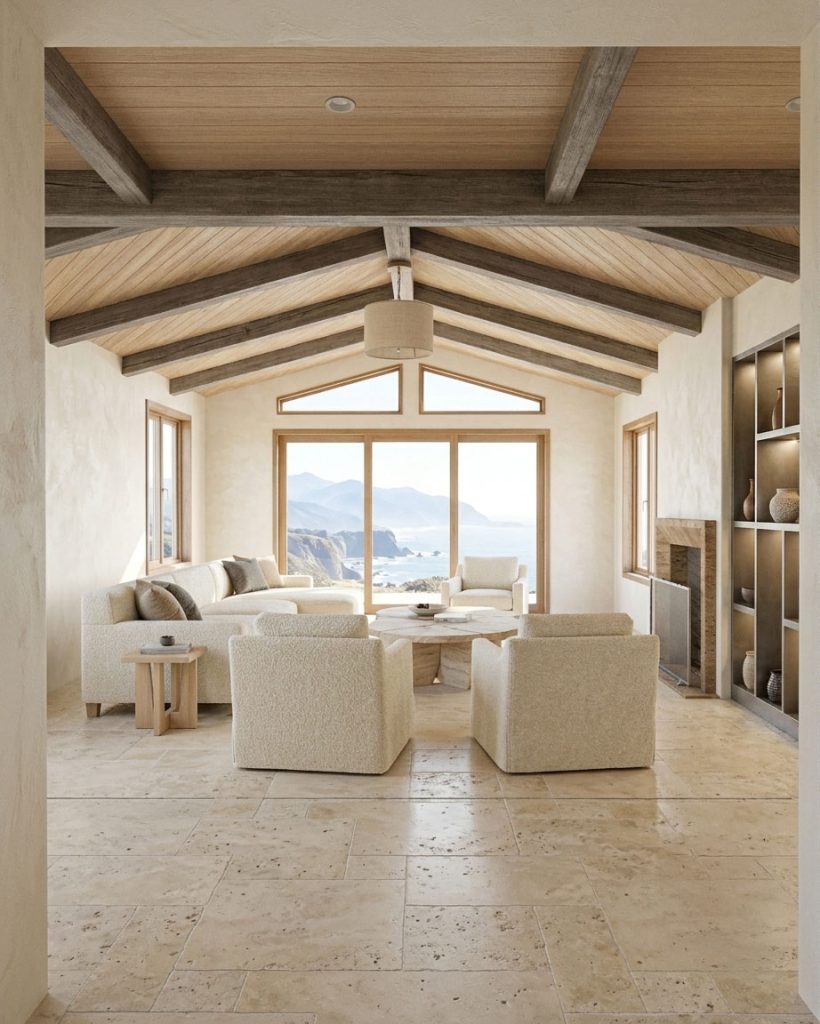
Ch. 01: Organic Modern Malibu
The short version: Warm, tonal, refined. A soft modern with texture doing most of the work.
Organic Modern, as a design style, is frequently misunderstood. It isn’t the absence of modern. It isn’t just “modern but warmer.” It’s a specific sensibility: clean lines that have been allowed to relax slightly. Precision that tolerates imperfection in the right places.
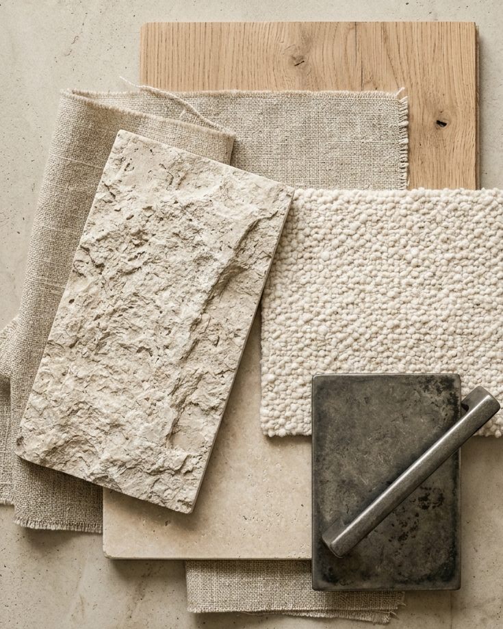
This palette pulls from the rock and surf- the warmer register of the image. The whites here lean yellow. The grays are unmistakably gray, but carry a warmth you’d feel before you could name it. Nothing in this palette is cool. Nothing is trying to startle you.
What the materials say:
The five materials in this chapter – white oak, boucle, natural linen, aged pewter, and travertine – are doing something specific together. They’re all tonal. They’re all textured. None of them are clean in the clinical sense. White oak has grain. Boucle has loops. Linen wrinkles. Aged pewter oxidizes. Travertine has voids.
That’s intentional. Organic Modern isn’t a pristine environment. It earns its refinement through patina and material honesty, not polish. The aged pewter is pulling double duty here – it introduces a metal element without going cold, which is harder to do than it sounds.
Who this palette is for:
This is a base palette. It’s versatile enough to anchor almost any room – not just coastal spaces. The Malibu geography informs its origin, but you could use this palette in a mountain home, a city apartment, or a desert retreat and it would read appropriately. It’s slightly chic. It’s controlled without being rigid. If you want a starting point that you can layer on top of, this is it.
It is, however, a palette that does ask something of the space. Organic Modern doesn’t forgive clutter well. The tonal nature of the palette means the room itself needs to do some compositional work. If you’re designing for a high-traffic family home, read on.
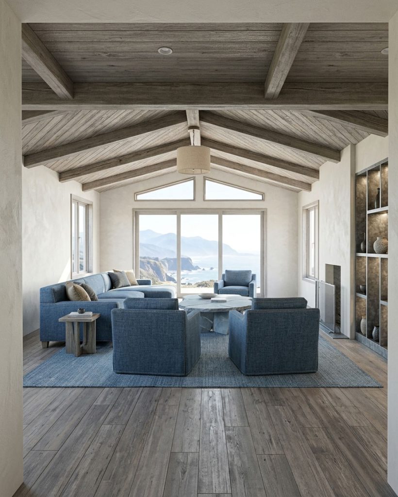
Ch. 02: Pacific Haze
The short version: Cool, layered, forgiving. A more rugged coastal sensibility built for real life.
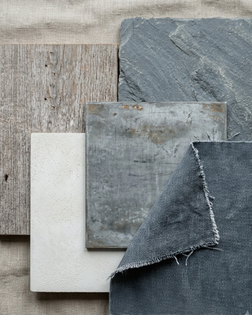
Pacific Haze leans into the blue register of the same image – the watercolor quality of a gray Pacific sky reflected in flat tide pool water. These aren’t the navies and whites of a traditional coastal palette. They’re muted. They’re a little muddy, in the best way. Misty, layered, slightly obscured – the way the coastline actually looks on an overcast afternoon, not how a paint company would render it.
The technical origin of this palette: it’s generated from the inverse hue values of the Organic Modern palette. The Photoshop workflow is a+ 180° Hue/Saturation shift applied to the source colors, which swings the warmth to cool. But these are still colors you could pull directly from the photograph – they live in the water, in the sky, in the wet shadow of the rocks. The inversion process surfaces them, it doesn’t invent them.
What the materials say:
Where Organic Modern is refined, Pacific Haze is collected. The materials in this chapter allow for more variation in surface, age, and origin. Think reclaimed woods. Found rugs. Objects with a history. The palette doesn’t fight patina – it expects it.
This is a palette that works with wear rather than despite it. Nicks, fading, the kind of softness that comes from actual use – Pacific Haze accommodates all of it without losing its design integrity. That’s a meaningful quality in a material palette and one that’s undervalued in design conversation.
Who this palette is for:
Honestly? More of us. Pacific Haze is the more forgiving design direction. It creates calm through its cool temperature without demanding perfection in the space. It’s inviting rather than aspirational. There’s room in this palette for a collected interior – layered textiles, a vintage piece, something handmade sitting next to something found.
It reads as authentically coastal in a way that doesn’t feel like a coastal theme. There’s a difference between a room that lives near the ocean and a room that is trying to remind you of the ocean. Pacific Haze is the former.
How They Work Together
Here’s what we want you to take away from this: these two palettes aren’t competing. They’re designed to coexist.
A home could be entirely Organic Modern – refined, warm, tonal, controlled.
A home could be entirely Pacific Haze – layered, cool, collected, forgiving.
Or a home could be both. The two palettes share the same source image, which means they share an underlying material logic even while pulling in different directions. An Organic Modern living room and a Pacific Haze bedroom can share a hallway without fighting each other. The harmony is already built into the methodology.
What the two palettes do is give you a framework for thinking about what kind of life a space is designed to hold. Organic Modern asks: What do we want to feel when the room is at its best? Pacific Haze asks: What does the room need to absorb while we ‘re actually living in it?
Neither answer is wrong. In fact, the most livable homes usually need to hold both questions at once.
Found Palettes is published as an ongoing series. New chapters release weekly on Instagram and are archived here as extended editorial entries. Subscribe to the Lare newsletter to receive new volumes as they publish.
No Comments